Calendar with single, multiple, and range selection — Temporal dates, optional time editing, and keyboard-friendly interaction.
A modern rewrite of react-infinite-calendar, built for React 19 with @js-temporal/polyfill for values.
reactleaf.github.io/calendar — full props reference, live examples, and guides.
- Modes — First-class
single,multiple, andrangeon one component (modediscriminant). - Dates — Props expect
Temporal.PlainDateorTemporal.PlainDateTimeonly, notDateor raw ISO strings. Parse strings at your app boundary withTemporal.PlainDate.from(...)/Temporal.PlainDateTime.from(...). - Optional time —
includeTimeenables header time editing and a dedicated time subview (scroll picker). Date-only flows stay on plain dates; time is minute-precision wall time, not IANA time zones. - Bounds & disabling —
minDate/maxDate, plus per-day disabling insingleandmultipleviaisDateDisabled.rangeuses bounds only (no per-day blacklist). - Stable shell — The card height is stabilized with CSS tokens so switching between day, month, and time views does not resize the shell, even as the infinite-scroll month list grows.
- Accessibility — Grid-oriented ARIA for the day body, focus management, keyboard navigation, and localized labels via
locale+ overridablemessages.
- React 19+ and react-dom (peers).
@js-temporal/polyfill(dependency alongside this package) forTemporalin environments that lack it.- Styles — Import the package stylesheet so layout and tokens apply.
pnpm add @reactleaf/calendar @js-temporal/polyfill
# or
npm install @reactleaf/calendar @js-temporal/polyfill
# or
yarn add @reactleaf/calendar @js-temporal/polyfill
Peers: react, react-dom.
Import the default styles once (path may vary by bundler):
import '@reactleaf/calendar/index.css'Theme hooks such as --calendar-color-accent, --calendar-body-height, and related tokens live in the bundled CSS; override them in your own stylesheet after the import if you need branding or density tweaks.
import { useState } from 'react'
import type { DateValue } from '@reactleaf/calendar'
import { Calendar } from '@reactleaf/calendar'
import '@reactleaf/calendar/index.css'
export function Demo() {
const [date, setDate] = useState<DateValue | null>(null)
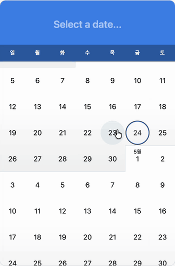
return <Calendar mode="single" value={date} onSelect={setDate} />
}Pick one date. The value is Temporal.PlainDate, or Temporal.PlainDateTime when includeTime is enabled.
import { useState } from 'react'
import type { DateValue } from '@reactleaf/calendar'
import { Calendar } from '@reactleaf/calendar'

export function Example() {
  const [date, setDate] = useState<DateValue | null>(null)
  return <Calendar mode="single" value={date} onSelect={setDate} />
}Select many dates; toggling a chosen day removes it. Use maxSelections to cap how many days can be active.
import { useState } from 'react'
import type { DateValue } from '@reactleaf/calendar'
import { Calendar } from '@reactleaf/calendar'

export function Example() {
  const [dates, setDates] = useState<DateValue[]>([])
  return <Calendar mode="multiple" value={dates} onSelect={setDates} />
}Choose a start and end date.
import { useState } from 'react'
import type { CalendarRangeValue } from '@reactleaf/calendar'
import { Calendar } from '@reactleaf/calendar'

const empty: CalendarRangeValue = { start: null, end: null }

export function Example() {
  const [range, setRange] = useState<CalendarRangeValue>(empty)
  return <Calendar mode="range" value={range} onSelect={setRange} />
}
CalendarRangeValue is { start, end } with each field DateValue | null. After a start is chosen, start is set and end may stay null until the range is finished; onSelect fires when the range is committed, and onRangePreview fires while the user is still choosing.